If you find value from my hard work below, please do consider sharing/subscribing.
I also post lots more useful charts and data on Twitter most days.
Something interesting is happening this year.
Gold is going up.
It’s out-performing the S&P500 YTD and is perhaps the only asset class pushing against new all time highs.
That’s information I want to pay attention to.
Gold +11.8%
S&P500 +6.5%
But what about the charts, how are they shaping up and what can we look for moving forward?
In this weeks letter, I’ll cover some key levels and a few correlations I think are worth keeping an eye on. So let’s get into it.
Spot Gold $/Oz
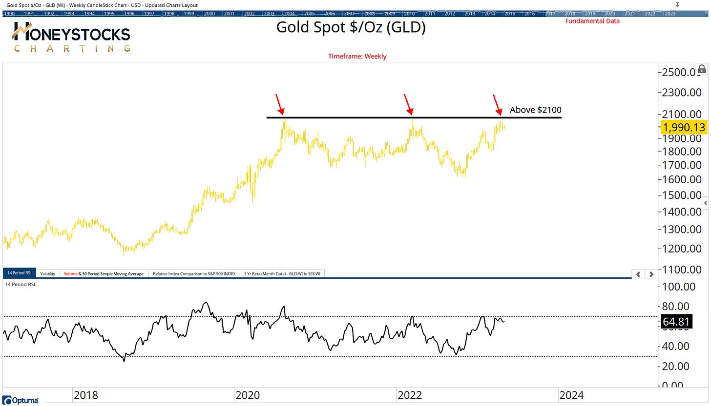
Technically, Gold has been range-bound for the last few years.
The way I learned it, the bigger the base, the higher in space.
Is gold gearing up for a historic break out set against a backdrop of negative market sentiment?
It sure seems like the stars are aligning.
$2100 is the level for me.
SPDR Gold ETF (GLD)
Most of us will prefer ETF’s so this is the chart from our ETF chart book for the SPDR Gold ETF.
$195 is the level here.
What about the broader market?
Before I get into this, let me be clear because I’m asked daily if I’m bullish or bearish on the market.
The market’s a messy, sideways, choppy, grinding mess, with differing opinions everywhere and a regional banking crisis unfolding.
Some folks are calling it a new bull market, while the Armageddon brigade are scaring everyone from deploying capital.
My own position is that I’m neither bullish OR bearish on the market.
It’s a stock pickers market so I’m focussed on risk : reward propositions on individual stocks/charts.
I’ve also mapped out the levels on my charts for when to communicate to our members when to get defensive.
EUR/USD and S&P500 (SPX)
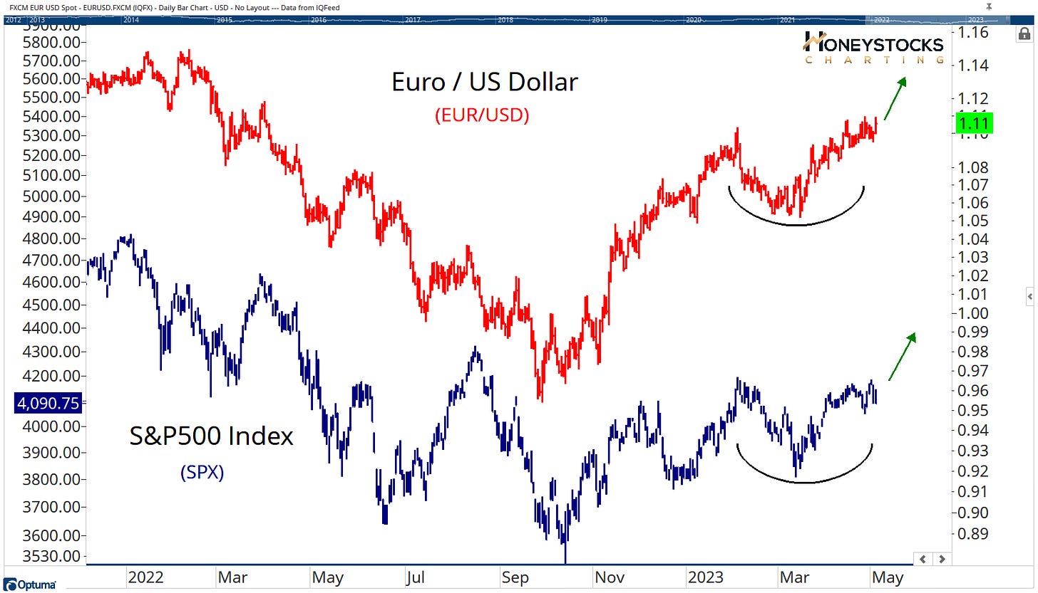
For clues to what comes next for the S&P500, I like to use the currency markets.
The EUR/USD likely won’t be front and centre for many of you, but if we see this chart break out (it’s still a big IF), I think it’s quite reasonable to see the S&P500 go with it.
But it’s worth saying, what the S&P500 does or doesn’t do isn’t really a big deal for me.
The market is much bigger than a basket of 500 stocks.
I’m fully aware of the market risks which is why I’m always open minded and prepared for all outcomes.
For example, our work in last nights Premium Midweek Half Time Analysis communicated to our members, I laid out some charts I’m focussed on for a potential broad based market decline.
Here’s 1 of them.
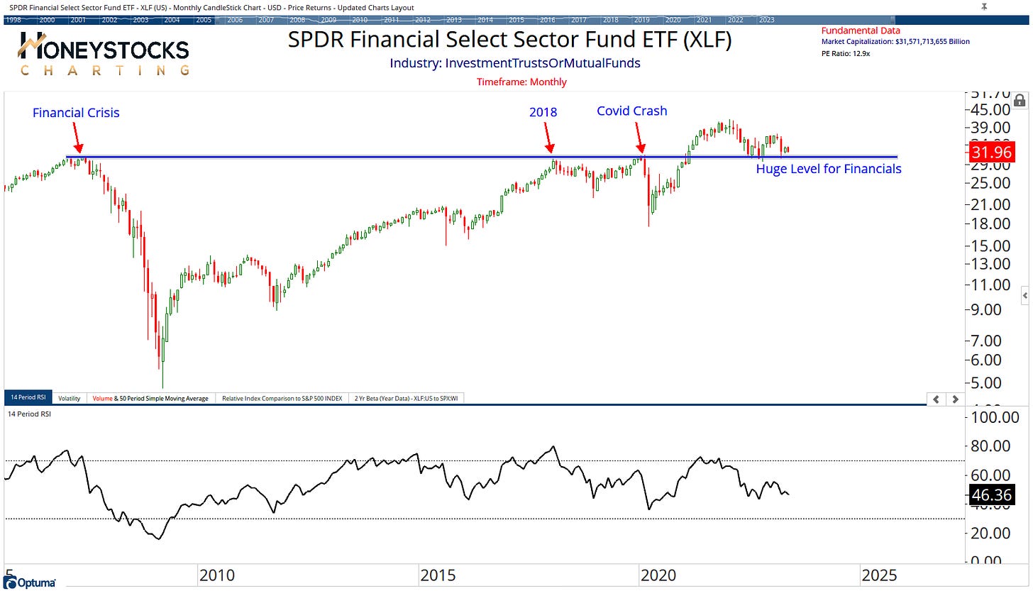
The Next Financial Crisis?
If the world is ending XLF will get below $30.
We’re not there yet.
There are plenty of market risks and data, so paying attention to the key charts that matter will probably serve you better than “reacting” to the news of the day.
If you’re long only, there are opportunities, and if you’re bearish, there are also opportunities.
There’s something for everyone.
Zoom Video Communications (ZM)
There are plenty of tactical trades to the long side, as well as stocks in distress.
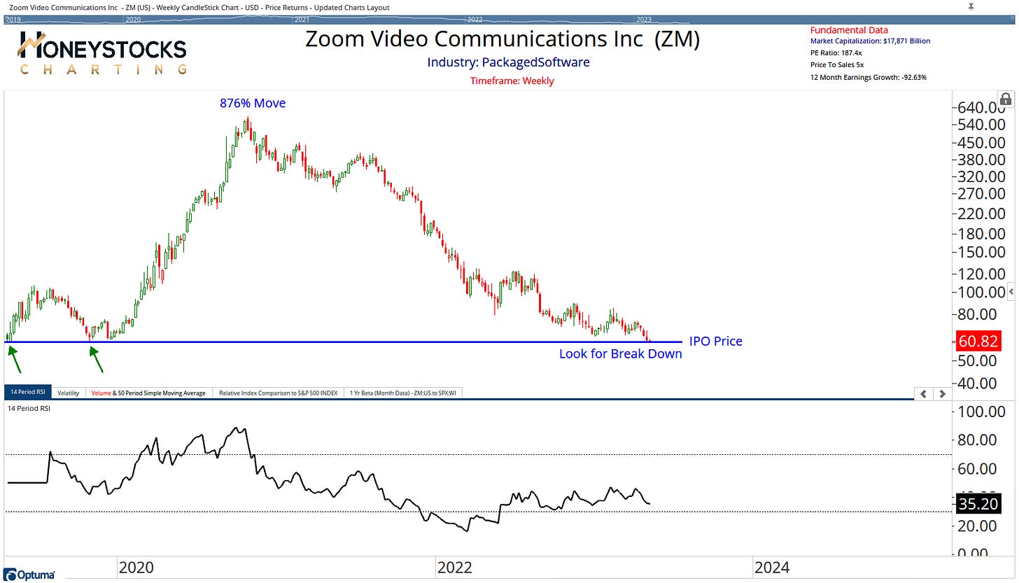
Look at poor old Zoom.
Back to the scene of its IPO after giving up an 850% move… there’s a lesson in risk management for someone out there.
If it breaks down, is that a bullish development? Probably not.
In Conclusion
I don’t like news headlines, media narratives or complaining about the Fed, so while the market keeps chopping, I’ll keep defaulting to my charts because I know my charts don’t lie to me.
Price is the only thing that matters.
Being open to all outcomes and managing risk would be considered sensible in the current environment.
Week In Review (Added 5th May)
Stay safe out there and have a great weekend.
We laid out a bunch of key charts and stocks for our members this week.
Please check our membership options below. We might make the difference.


