If I solely relied on my FinTwit (X) observational skills and listened to everyone in the professional game I’m not sure where I’d be looking just now.
Either everyone’s super bullish and everything’s going to the moon, or the negative perma bears who’ve been calling for 1929 for the last 2yrs are continuing to predict doom in the months ahead.
It’s really tough listening to other folks and figuring out who’s worth paying attention to.
Me??
I prefer to use my own logical charts and try to stay away from everyone else’s thoughts and feelings. It’s just easier that way.
If you missed last weeks monthly deep dive, I covered a lot already and I’ve embedded it below for you, but beyond that, I’ve got a bunch of great new charts below for you.
What About Tech?
I’ve been very clear about Technology stocks over the last few months, whether it’s been identifying the exact bottom in all the mega cap tech stocks like (AAPL / TSLA / NFLX / META / NVDA) when all the “professionals” around me were telling everyone to short the market and sell.
I remained steadfast and stuck to the charts.
Many of our clients & members were buying up the dips. (I have the time stamps to back that up if anyone wishes to request those)
But where next I hear you ask?
Invesco QQQ Trust (QQQ)
SPDR Technology ETF (XLK)
For me, tech stocks (broadly speaking) are now approaching logical upside targets. I don’t make up the rules, Fibonacci does.
Does this mean I’m selling tech stocks and going short?
Absolutely not, I advocate the use of trailing stops.
The charts for me, communicate that being super selective and cautious up here is sensible because I think anyone with half a brain can see lots of stocks are over-extended and probably due a perfectly healthy / reasonable digestions of gains.
It’s actually worrying me now that all the CMT’s are peak bullish. (they’re a great contrarian indicator if you haven’t figured it out yet).
Yield Curve
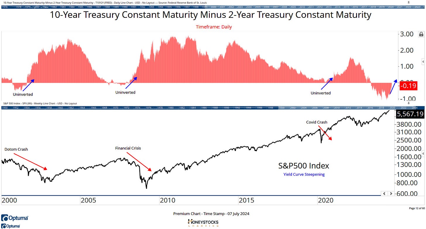
I also have my eyes firmly on the yield curve given it’s been inverted for the longest period in its history and as the chart shows, when we steepen and get over the line, that’s usually a signal to get fully cautious.
Top Sectors Month To Date
1 of the data points I’ve presented to our clients and members this weekend is the possibility we’re seeing the early signs of a rotation into more cyclical / metals oriented names.
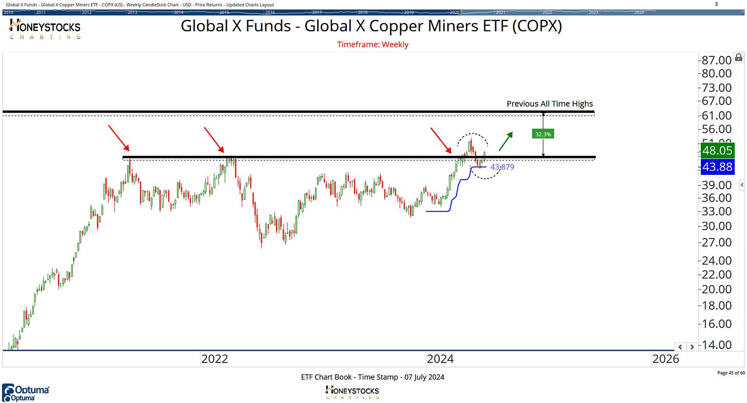
Copper Miners (COPX)
Many of the metals charts look like this… failed break out & shake out… so the question I have going into the next 2 weeks, are we going to get the break outs in these metal / mining names?
Newmont Mining (NEM)
Our community received a chart for Newmont back in February after a client requested it to express a bullish Gold position, in fact I’ll add that as well because I hate it when other folks use Harry Hindsight Indicators and don’t back it up.
I think NEM is one of the many names that’s potentially setting up again with some decent upside objectives.
Palantir Technologies (PLTR)
You may have seen me post this Palantir chart to X over the last week, the chart has gone mini-viral so I thought I’d add this as well.
I think it’s setting up also.
Whatever comes next, have a great week.
Reminder - Sale Ends Tuesday
If you enjoyed the charts above, we still have another 48hrs for you to access all of our premium work / content. There’s a link below, you should click it.


