Technology, Semiconductors, A.I… if you pay attention to the charts like I do, hopefully it’s been a decent / rip roaring start to 2024 for you after the unbelievable end to 2023.
Rather than re-hash some bullish charts in the tech space (I provided 20 of them over the weekend on YouTube in case you missed it).
This week I’m going to get into a few of the charts in the Commodities / Energy space I think are looking more than interesting just now.
Weekend Post - February Outlook (Lots Of Tech Charts)
Weekly Letter Overview
I’m sure we can all see it coming a mile away.
Geo-political events in the Middle East are starting to gather momentum, and while it’s incredibly sad to see another conflict take shape, the unfortunate reality is we know from history how it’s likely to play out in Energy markets.
Since I’m paid to assess the stock market, I figure the best thing to do is continue doing that and I’ll leave foreign policy experts to debate everything else.
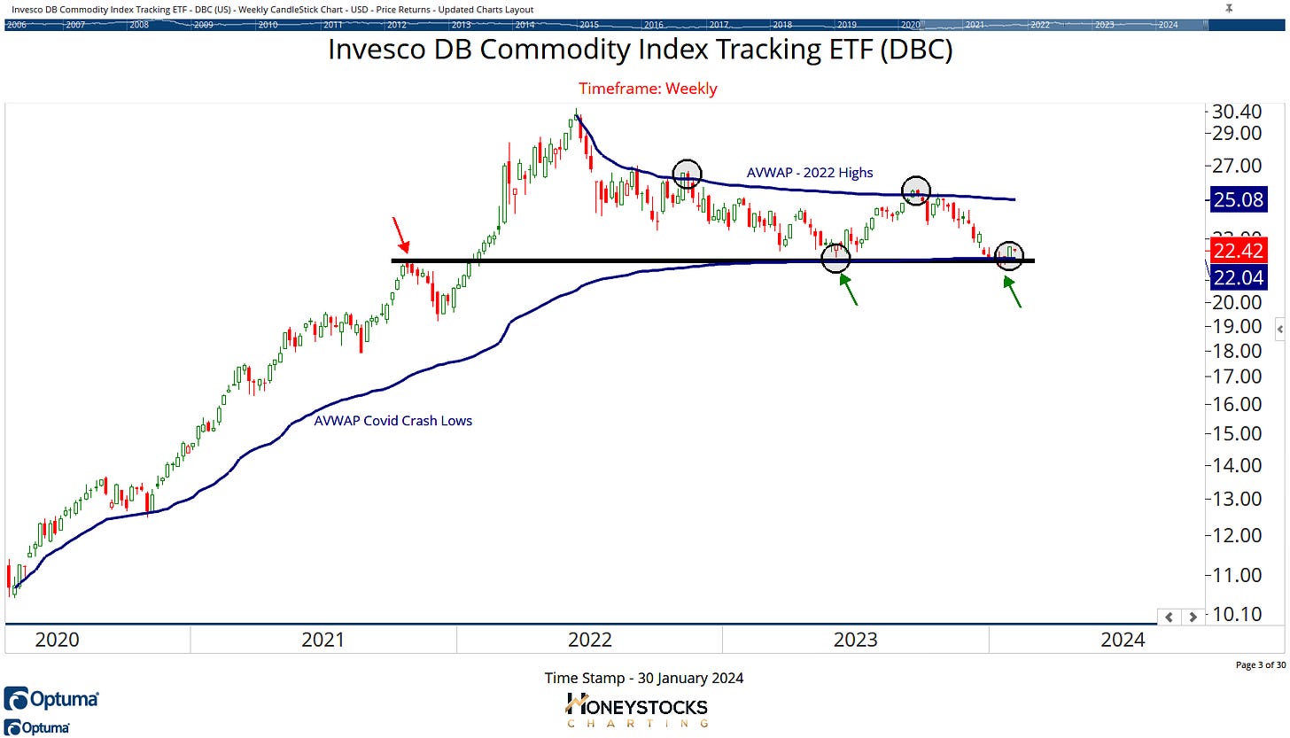
But lets start the week with a general chart for Commodities.
Invesco Commodity ETF (DBC)
This particular ETF is essentially made up of 50% Energy (weighting below) and for me, it’s very noticeable DBC caught a rebound last week at very logical price levels.
Gasoline 13%
Heating Oil 13%
Brent Crude 12%
WTI Crude 12%
So what do the charts look like and how can we potentially profit from a possible bullish reversal in the energy markets?
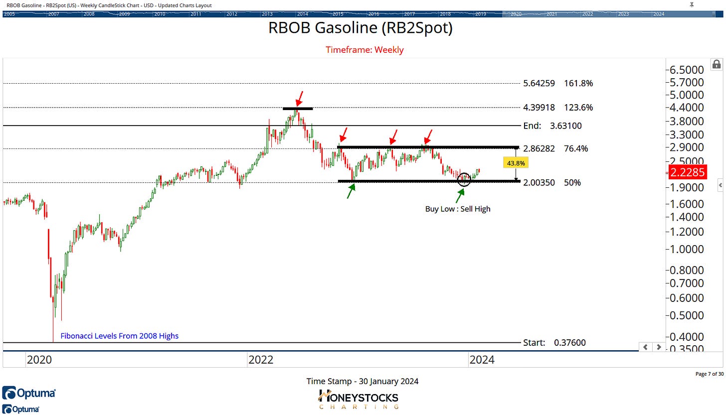
Gasoline
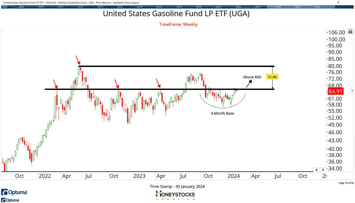
US Gasoline ETF (UGA)
Gasoline is currently trading at the low end of its range and it’s been 1 of our commodity picks over the last couple of weeks, and as we can see from the ETF, it’s been basing nicely for the last 4 months and is now on break out watch.
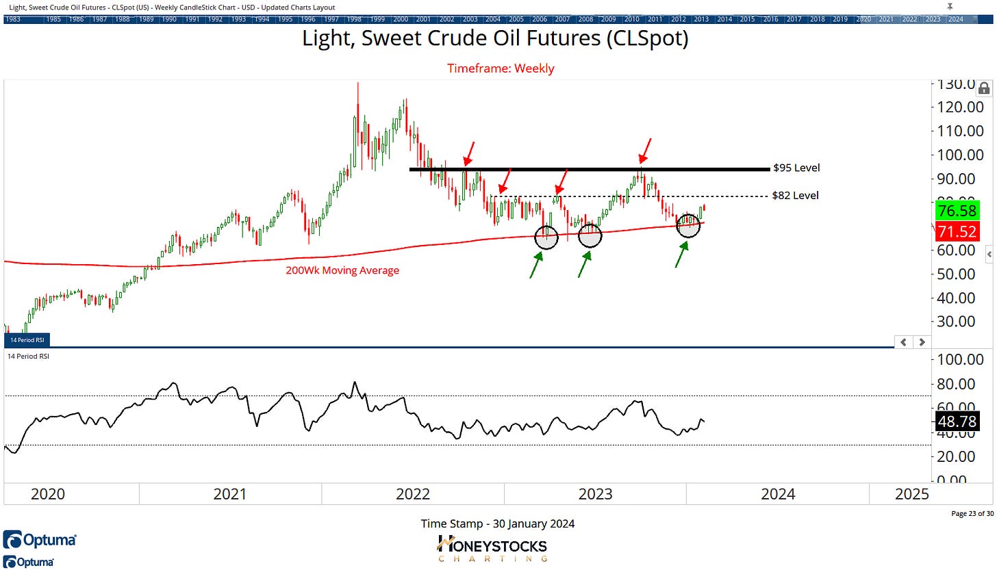
Crude Oil
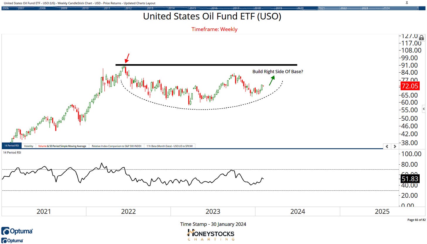
Another of our buy low : sell high charts has rebounded exactly where it was supposed to rebound.
Is it a tradeable bottom with a very easy out?
US Oil Fund (USO)
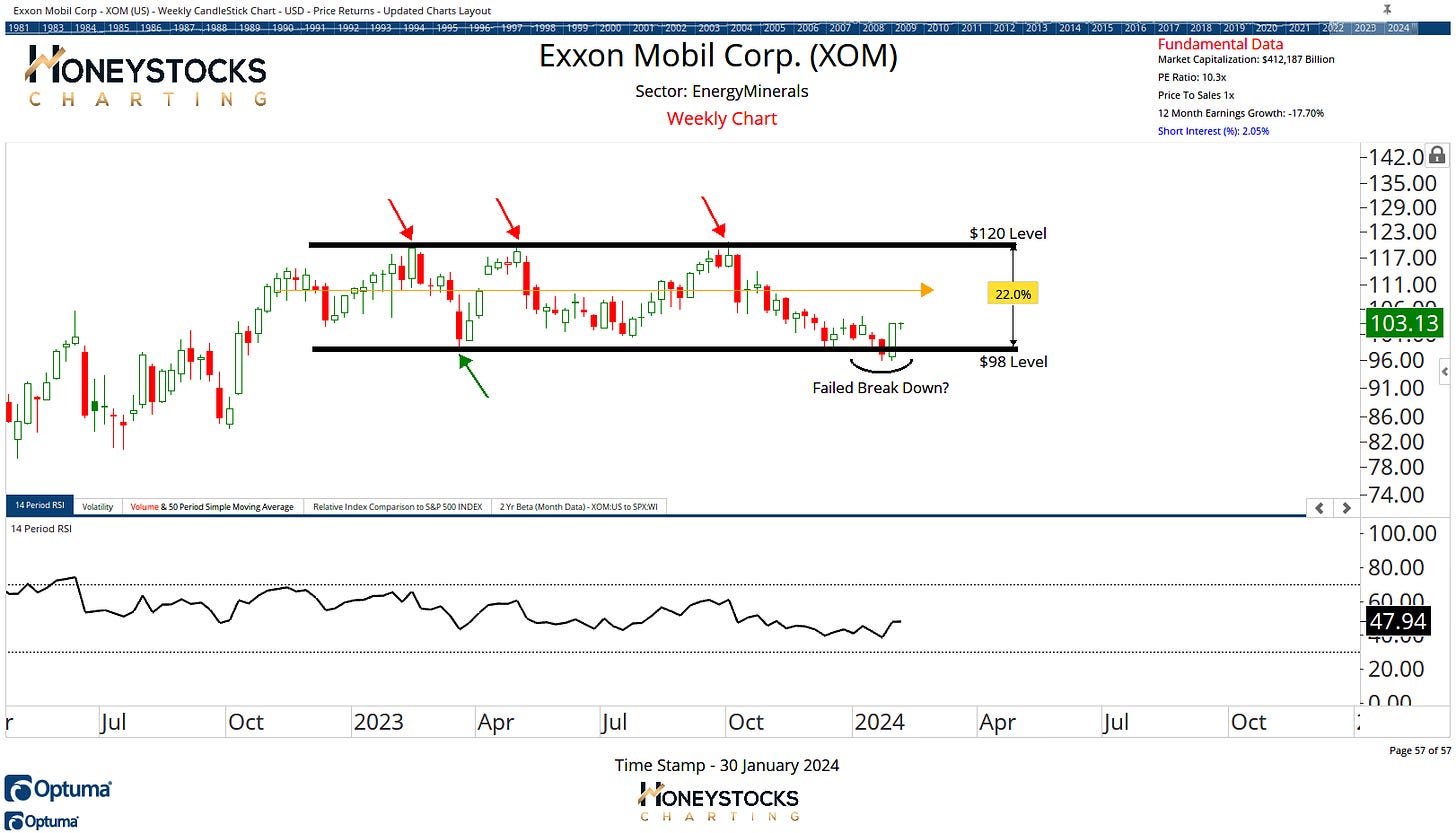
Exxon Mobil (XOM)
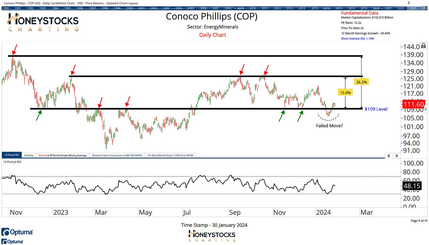
Conoco Phillips (COP)
Are we potentially seeing the early signals of a tradeable bottom in Energy names?
It’s a question I’ve been asking myself for the last couple of weeks and I’ve already communicated the charts for Gasoline and Exxon Mobil to our clients.
But let me be clear about something, because I think there’s a huge misconception around these kind of charts and the dummies who make continual market “bottom calls” for months / years on end without any regard to risk management.
My own personal view on market bottoms…
Tradeable Market Bottom Definition
“A chart which clearly communicates a defined level in price which offers a good risk : reward proposition by going long, whilst also offering a very clearly defined exit route in case the thesis is incorrect.
In Conclusion
Tech has been really great for a long time.
It’s been THE place to be as I’m sure you know very well, but what happens when we get an inevitable rotation…
These are the questions I like to ask and what I like to prepare our clients and subscribers for in advance.
Charts help a lot.
Have a great week and please do consider sharing with likeminded folks.
Here's what you can expect from our Substack membership.
From next week, you can access this letter and our monthly outlook exclusively on Substack via our subscription.
The Weekly Letter.
Monthly Market Analysis Deep Dive.
Investment / Trade Ideas (Within Letter & Monthly Analysis)


