


It’s been almost a year since I’ve written anything for Substack, but since it’s Juneteenth in the US and equity markets are closed, I have a couple of hours to kill so I thought I’d share a few of my best charts for your consideration over the coming weeks.
For clarity, since the VIX buy signal in April, despite all the negativity and the bearish sentiment, I’ve been WILDLY bullish (feel free to check my last 2 posts) and now that we’re seeing some emerging global macro headwinds, I’ve had a lot of requests in the last 10 days for my technical view.
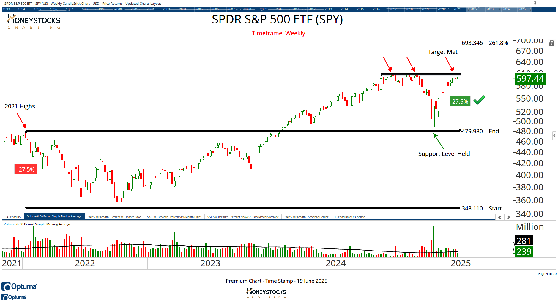
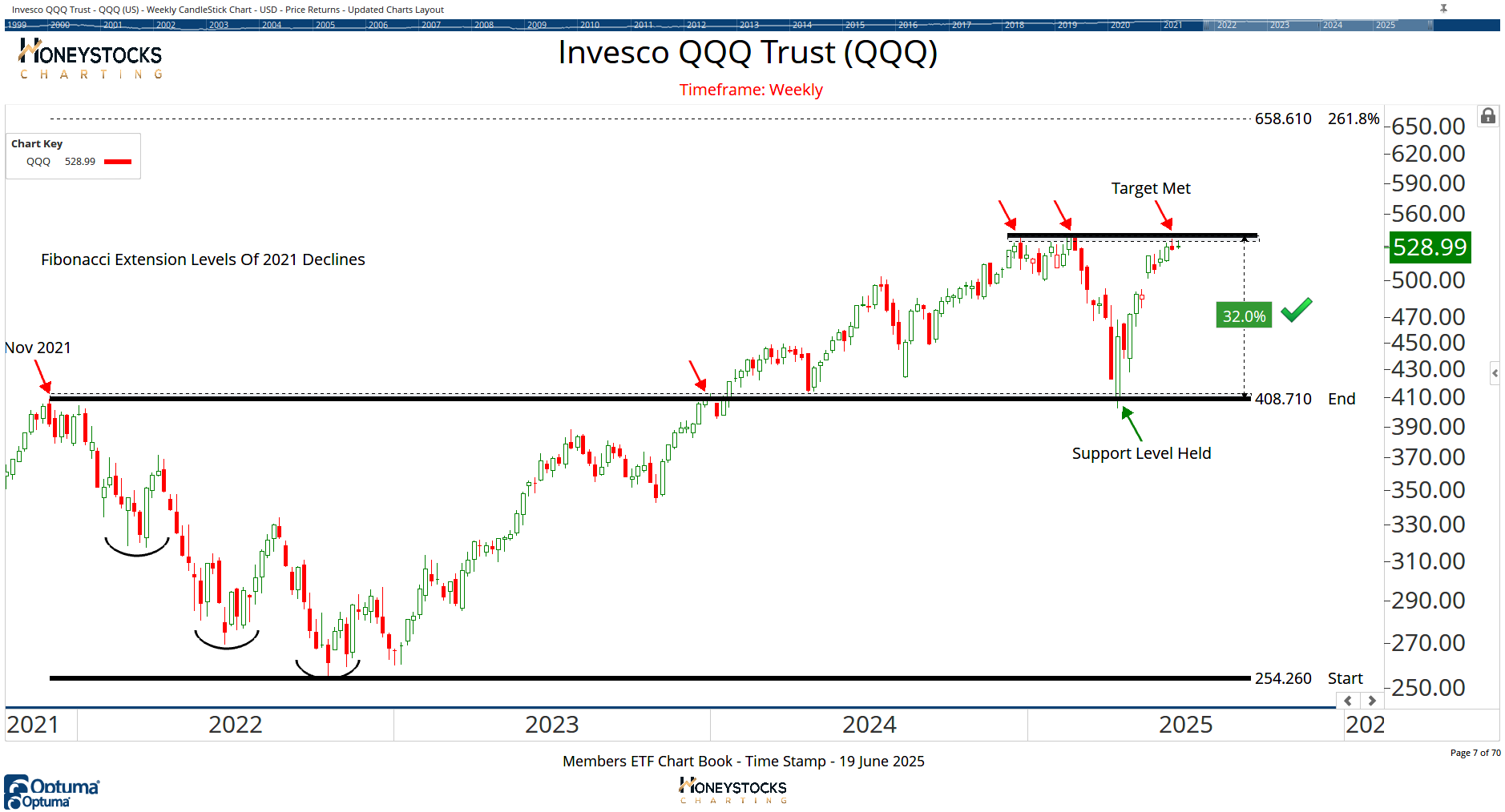
Lets start with the big boy indexes.
S&P500 Index ETF (SPY)
Invesco QQQ Index ETF (QQQ)
NYSE Composite Index (NYA)
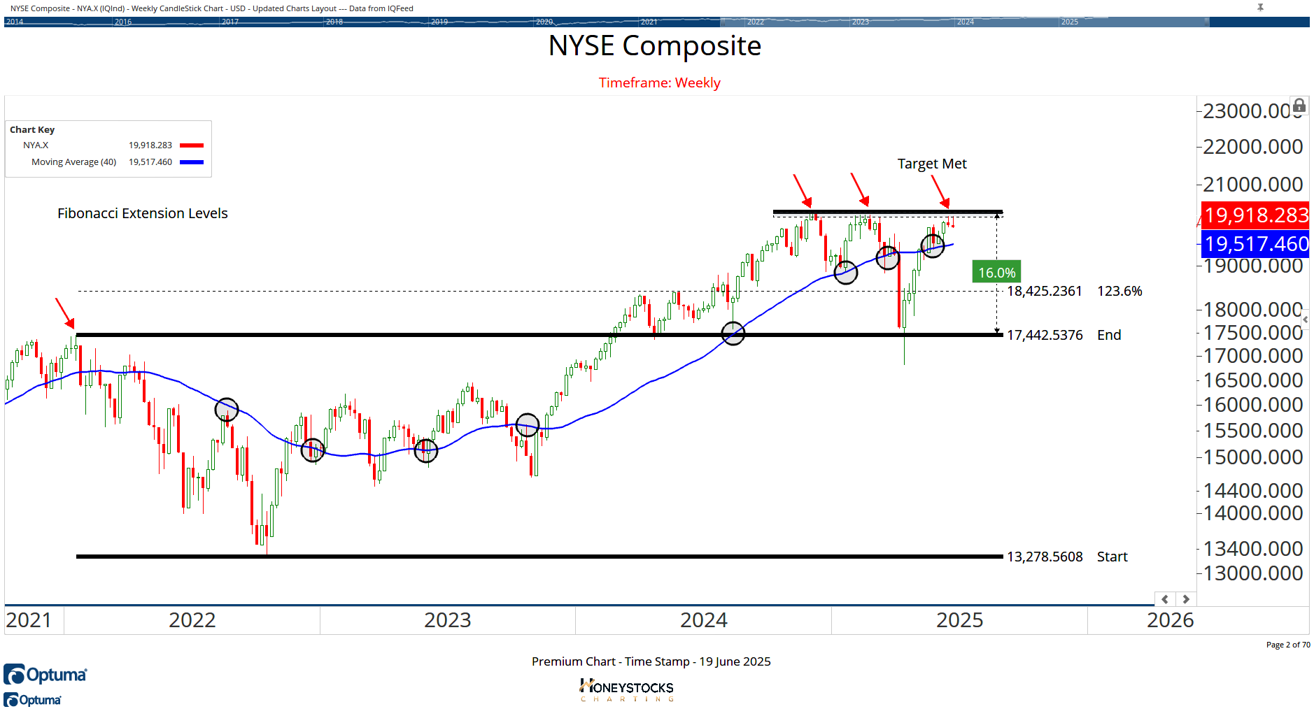
As the charts show, all of the major indexes have now met logical upside objectives set against a backdrop of….
Iran/Israel war
Will the US get more involved?
FOMC Interest Rates Holding
Recession Risk
Everyone’s wondering whether the market has the legs to break out to new all time highs and while I’d love nothing more than stocks to continue climbing, I think there are a couple of charts which may offer clues.
German DAX Index (DAXX)
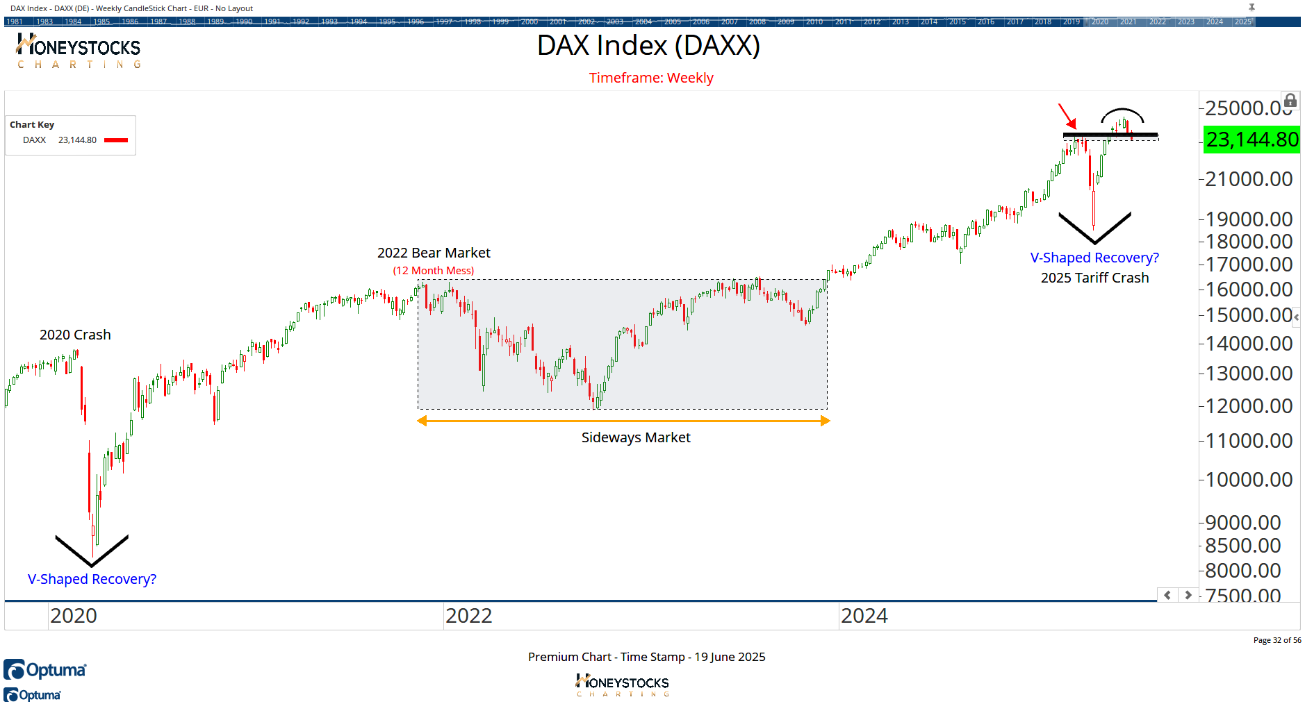
If the German DAX fails here at all time highs, I think there’s a very real possibility this could filter into US / Global markets… so I think the DAX is worth watching over the coming days.
Real Gross Domestic Product
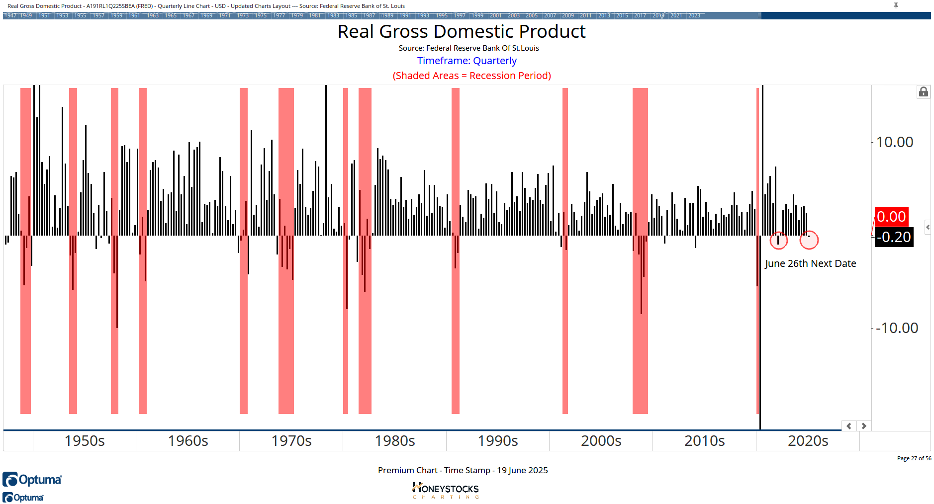
The other chart I’ve prepped my clients & members over the last couple of weeks for is the next GDP print which is scheduled for next week.
If there’s a second negative print, I could see a scenario play out that brings stocks under pressure.
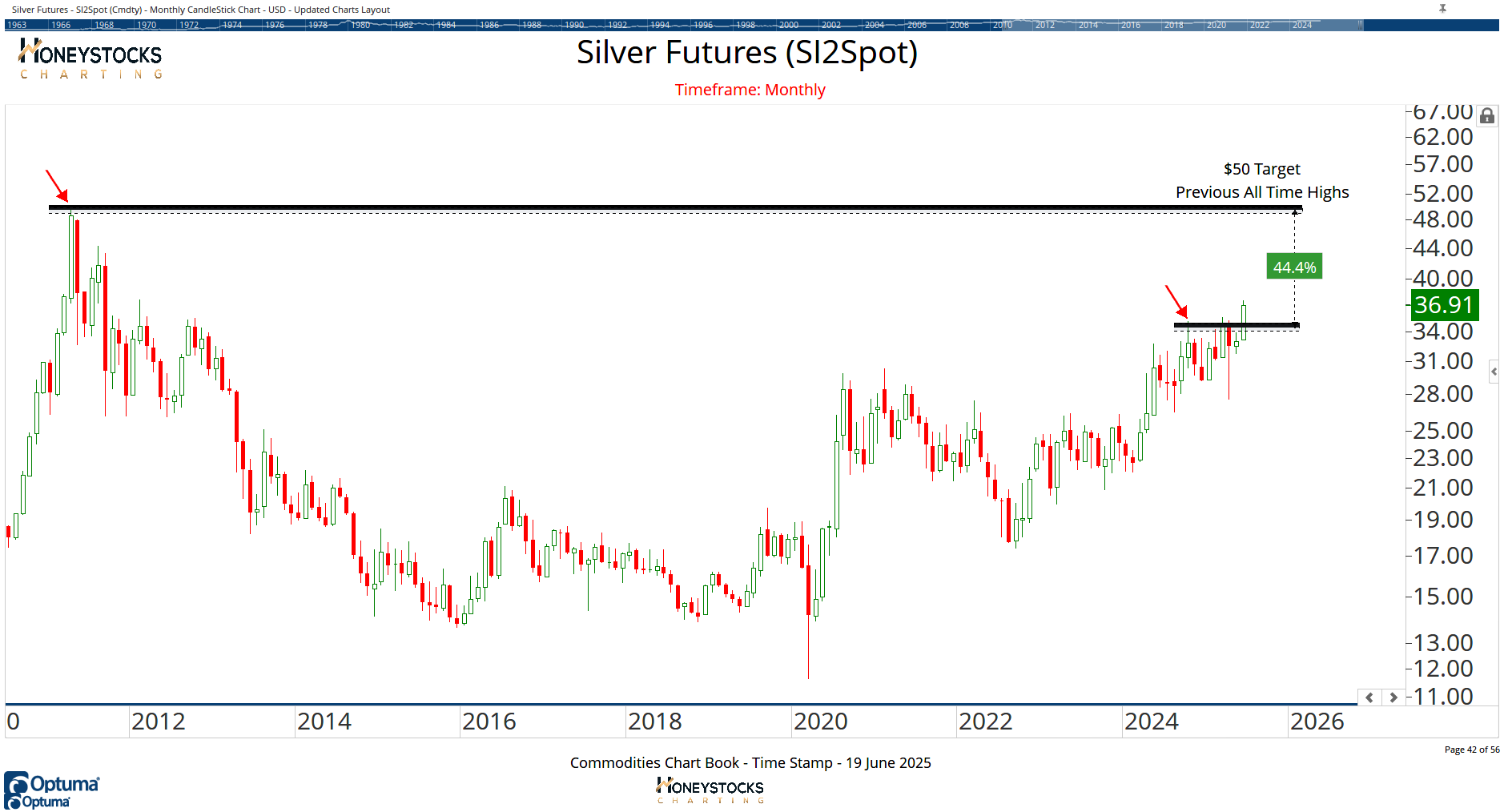
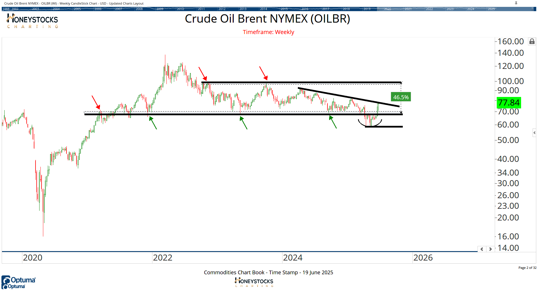
There are still areas of the market to consider to the long side which may be ok with the global macro headwinds.
Silver Futures
Crude Brent Oil
In Summary
Wherever you get your stock market content, I’m sure you’ve realised by now there are no shortage of opinions.
There are ENDLESS data points that both bulls and bears use to confirm their bias for the market.
I figured out a while ago what charts matter for my timeframe and what charts help my clients and members stay on the correct side of the market
We’re all playing a risk management game.
It’s not a prediction game and the charts above (at least in the near term) are communication brand new bullish positions are tricky, especially since the market has hit a 2yr S&P500 return in a matter of 8 weeks.
That doesn’t mean bearish either by the way, it just means it’s possibly a good time to observe a little more as the turbulence whipsaws the late to the party bulls.
If you like the rational views above, feel free to check out our market time stamps / performance data and membership options at the link below.
Access Our Premium Content & Investment Community