Please consider sending to friends and like-minded folks or sharing with your social media followers. It would be hugely appreciated. Thank you.
Before I get into this weeks mildly bullish and bearish letter, let me just kick things off by acknowledging that it’s been a couple of weeks since the last letter.
Apologies for that.
I know 99.9% of you won’t pay attention to Scottish weather systems but there’s been a lot of flooding recently. And I mean a LOT of flooding.
You can google “Storm Babet Flooding“ to get an idea.
Thankfully no real damage to either my property OR my mums, so back into the charts we go.
Before I get into it, a couple of disclosures since our last letter.
My client work is bullish some stocks and I hold bullish positions.
It’s also VERY bearish others and I hold bearish positions.
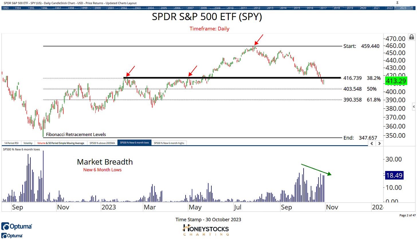
S&P500 ETF (SPY)
Correction’s aren’t much fun if you’re not used to them. In fact, they’re pretty darn miserable.
But like every correction, there’s always a ray of sunshine hovering around at the end of the tunnel for those who prepare and risk manage through it.
And when I look at the charts, the S&P500 to me is starting to look a LITTLE constructive when we look at the breadth data.
I like to use breadth at market tops / bottoms and assessing new highs/lows is a good starting point for my technical world.
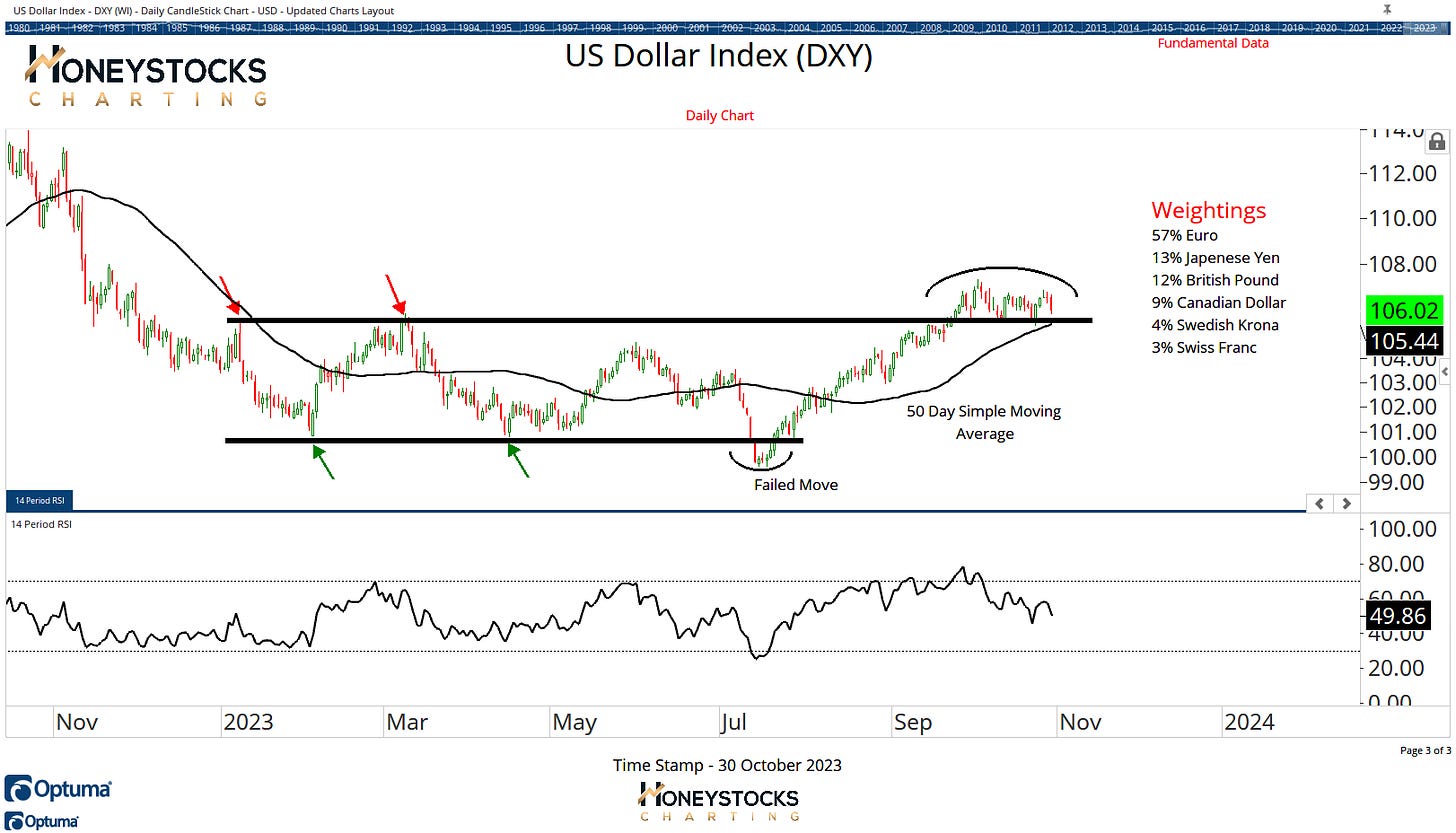
US Dollar Index (DXY)
But if there’s 1 chart in the entire world that’ll tell you what comes next…. it’s STILL the US Dollar.
No ifs, buts or maybes, after 3yrs, it’s STILL the key… this is the chart that’ll tell you when the market is going to put in a face ripping broad based rally.
As everyone knows, I don’t make predictions if something will or won’t do something, I prepare in advance and if it happens it happens.
With a 57% weighting in the US Dollar, we should also look at what the Euro’s doing?
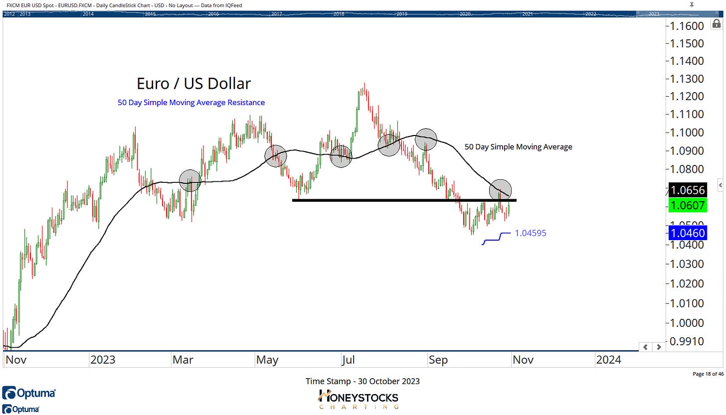
Euro / Dollar Pair (EURUSD)
It seems really dumb to say this because I’m not massive on moving averages these days, but they’re good for identifying a potential change of trend, and in this case, both the Dollar Index AND the EURUSD pairing are close to moving beyond in both charts.
Volatility Index (VIX)
The VIX is still elevated and now chilling out in the 20s whilst earnings season is in full swing and it’s been a really good environment for bearish bets.
I’m often accused of being a perma-bull because I’m always looking at things through the lens of “what if it’s not a bearish as everyone thinks it is” and looking for the signs of a market bottom because I already know identifying the bottom will drive MASSIVE performance numbers.
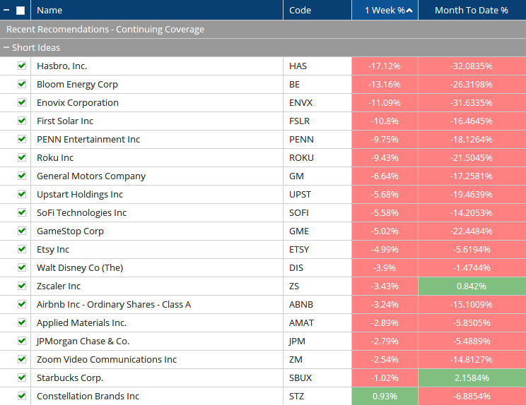
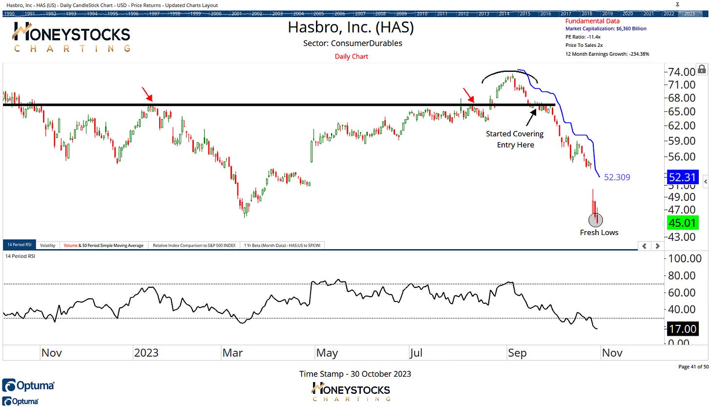
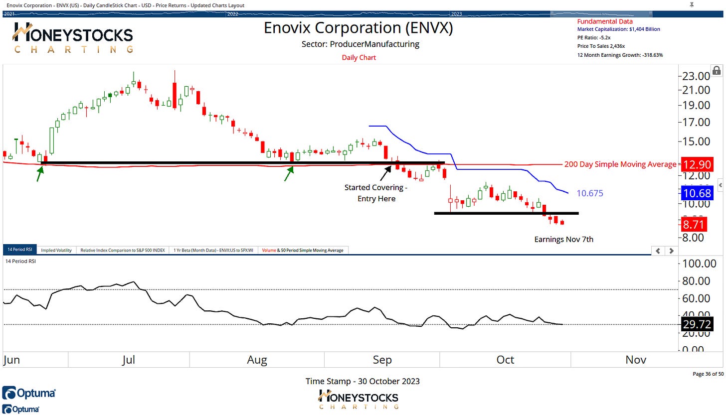
For disclosure, these are the bearish charts I’ve been covering for our clients/members over the last few weeks.
Hasbro (HAS)
Hasbro is a good example of what I look for and ENVX is another.
Enovix Corporation (ENVX)
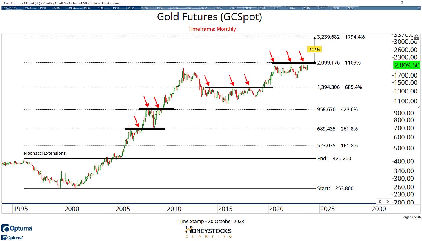
Gold Futures
Gold is now featuring a lot more prominently within my premium work at the moment and I’ve started putting the best charts in the gold mining space to our members in preparation for a POSSIBLE break out in Gold.
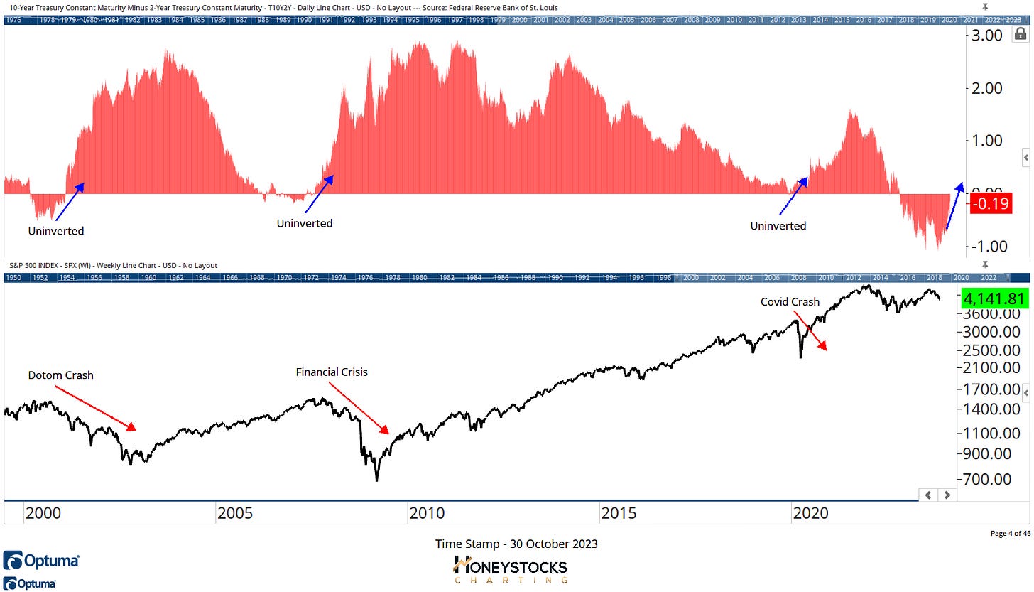
It’s not there yet, but are we looking at a historic break out for the Gold Bugs set against a backdrop of the Yield Curve advancing?
Yield Curve / S&P500
The chart above is probably the scariest chart I have, but that doesn’t mean everything will fall off a cliff because I take the view we’ve already fallen off a cliff.
In the meantime, I’ll do my best to find the best bullish AND bearish charts.
How do you see it playing out with the market? Let me know in the comments.
See you next week sometime.
Access All Our Premium Work - Link Below


