It’s been an interesting last few weeks hasn’t it?
Jackson Hole, bearish engulfing candles, interest rates, head & shoulder patterns, Mike Wilson’s bearish again, more bearish economic indicators… unless you have a systematic process to keep you in the market (or buy back into the market) when everyone else is crumbling around you, it’s super tough.
I learned a while ago headlines don’t help anyone so I don’t pay attention to them.
The only thing I like to focus on is the ONLY data that matters, the price of the market.
This week, I have a few important charts to communicate, but lets start with the bond market.
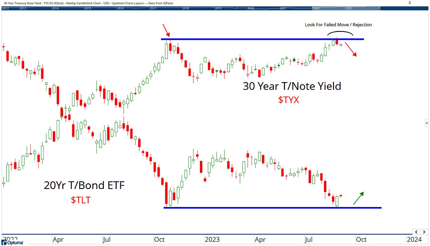
30Yr T/Note Yield and TLT
Everyone and their dog is looking for a potential bottom in the bond market and TLT seems to be the vehicle of choice for most.
We shared this chart with our clients last week and we’ve had a mini rebound of sorts, but to have REAL conviction in the bond trade, we want to see the 10 and 30yr T/Note Yields roll over at current levels.
Currently (for me) it’s a 60/40 trade but there’s also a very clear line in the sand, below last Octobers lows in TLT, all bets are off.
If the TLT chart does break down, I’ll just add it to my possible failed move watch list.
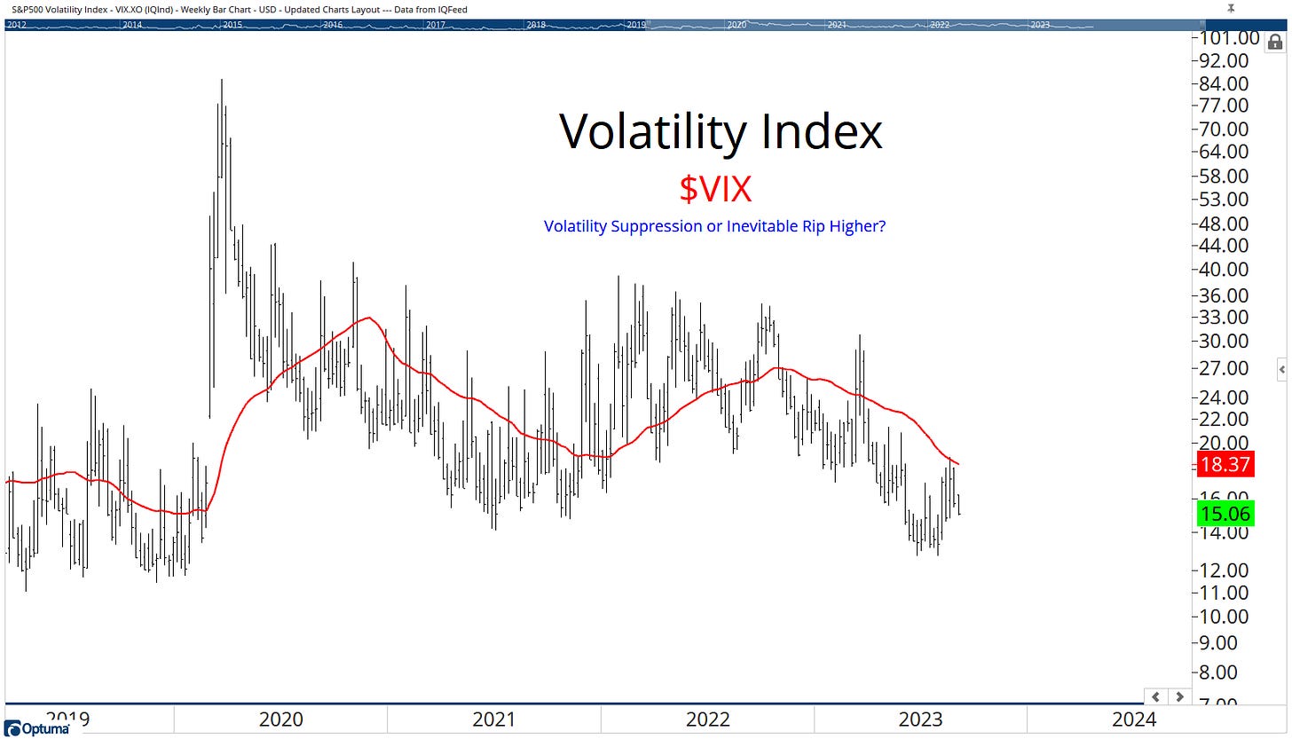
Volatility Index (VIX)
I shared this chart last week and thought it was worth sharing again because volatility (for the moment) continues to be suppressed.
I said in last weeks letter the market was suggesting we’re dealing with a healthy pull back (a 10% tech correction was quite significant).
It’s 1 of the charts which lead me to put a few tactical, bullish charts to our subscribers.
We’ve put the likes of TSLA, AAPL, GOOG, MRNA, SPOT to name a few over the last 10 days.
The question we all have just now, is this a suckers rally or is it a meaningful bottom?
Unfortunately I don’t have an answer for you, but there are some clues in other areas.
Relative Rotation Graph
It’s quite telling that we’re seeing out-performance for a number of “value” areas of the market coupled with recent under-performance in technology.
Let me be clear about something though.
Relative strength is completely random and those tech charts could about-turn any minute. (the rotation graph tends to do that which is why I only use it as a “visual” - I don’t make investment decisions based on it).
When a market (or area of the market) corrects, waiting for stocks to show up on relative strength scans is dumb.
Like, not just a little bit dumb, I mean really f*****g dumb.
Hence why we put some tech charts out LAST week.
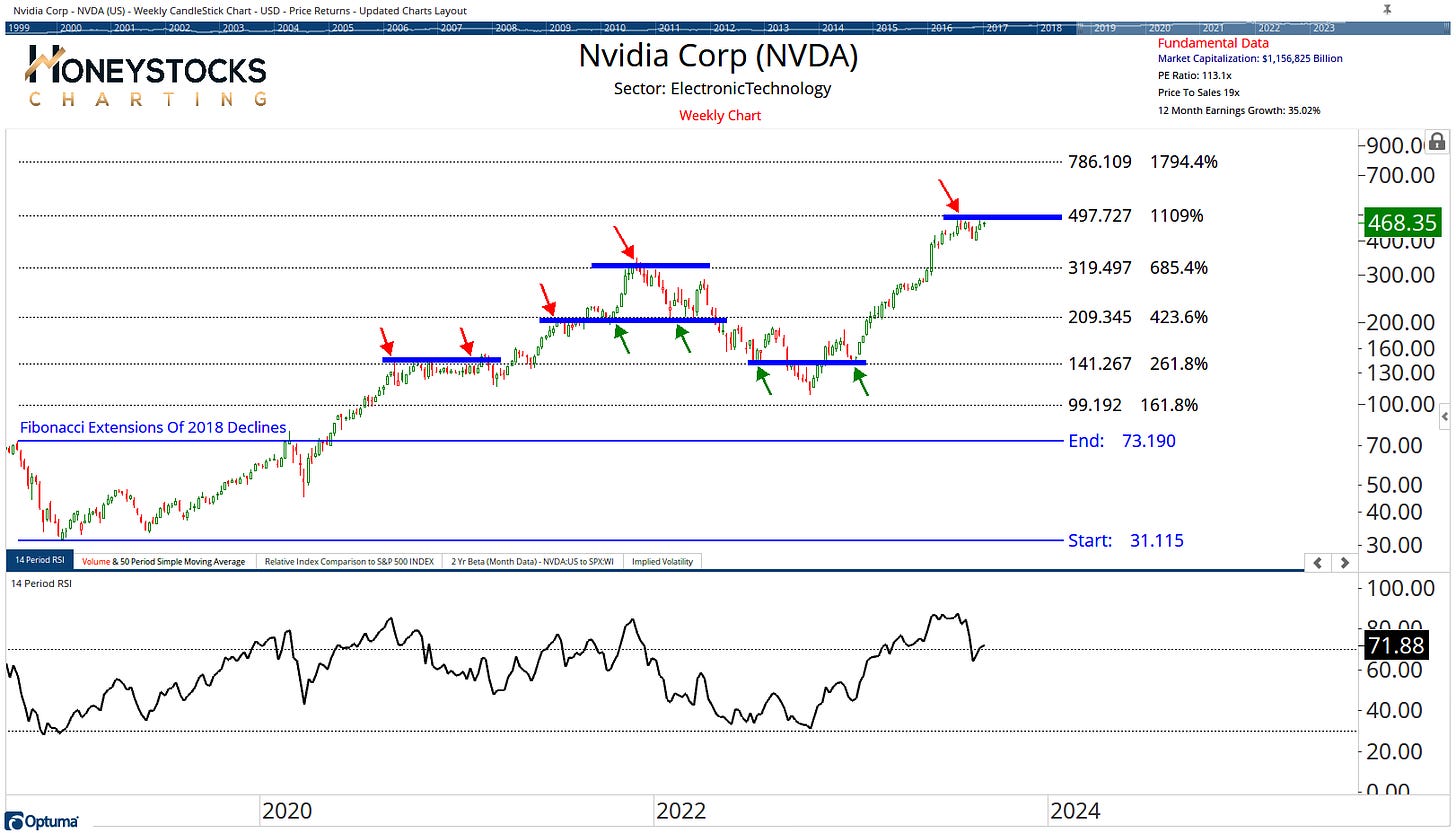
Nvidia Corp (NVDA)
I’ve also been asked a lot about NVDA this week since it reported stellar earnings and sold off.
I can see Jim Cramer has given it the dreaded vote of confidence in the last 48hrs also.
The chart is straight-forward, we already met upside our objectives, and for me it’s now a game of patience and waiting for either a massive pull back or a break out above $500.
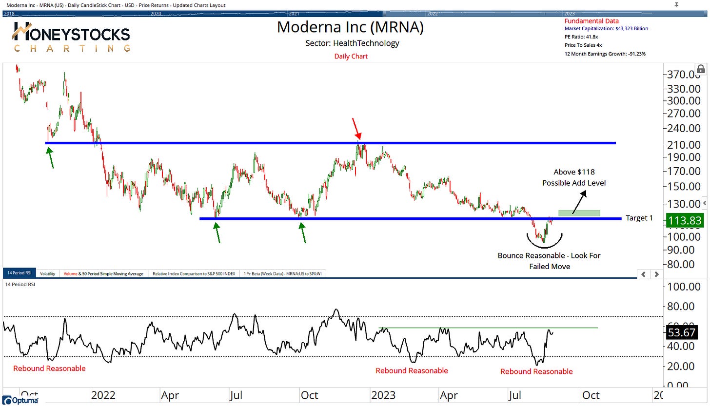
Moderna (MRNA)
MRNA has been 1 of our buy low: sell high charts over the last couple of weeks and it’s been working very well and +15% or so.
New entries might make sense on a possible failed break down AND a break out of its bearish RSI regime.
In Conclusion
If we sat down and had a beer together, I’d tell you I’m 50:50 on where the market goes next.
Honestly, I’ve no clue.
Nobody does. Not Bloomberg. Not CNBC. Not FinTwit. Not me.
But that doesn’t mean there aren’t risk : reward propositions on HEAPS of names just now and tactical trade opportunities (both long and short).
I don’t think anyone can have any kind of confidence in where the indexes go next, but that shouldn’t rule out the possibility of assuming positions in the market.
Just my 2 cents.
Have a great week and please do forward to like-minded friends if you enjoyed the read.
CLICK BELOW TO ACCESS OUR PREMIUM WORK


