It’s been an interesting start to the year, with lots of new information to digest, so in this weeks letter I think it makes sense to dig into a couple of the themes I’m seeing develop under the surface.
So lets just get into it.
At the index level, the battle continues at key levels in most of the major averages, but for me, the US Dollar is still communicating the most important information.
Lets take a quick look at the performance so far this year.
S&P500 Index +0.2%
Invesco QQQ +0.0%
Dow Jones -0.2%
Mid Caps -1.8%
Small Caps -3.7%
Micro Caps -3.9%
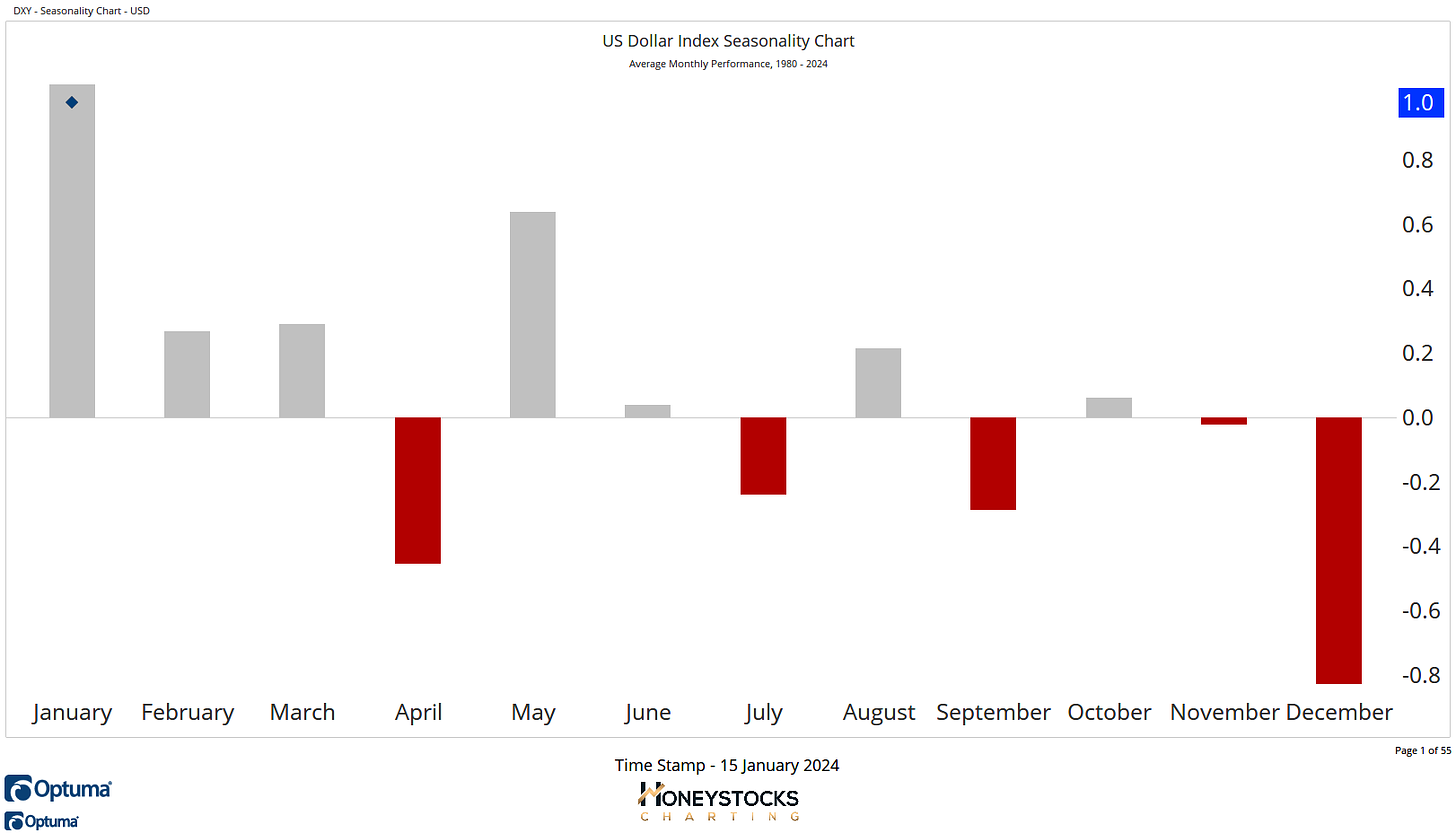
US Dollar Index Seasonality
The message is clear, a rising dollar continues to be a problem, a real big problem for stocks. I presented this chart on the 2nd January (That Weekly Letter Here)
A rising dollar doesn’t mean all stocks will struggle, let me be clear about that.
But I think the market message is pretty clear, a rising dollar is something to keep a very close eye on.
1 Chart Snapshot
The Dow has already broken out to new all time highs, and we’re seeing the S&P and Q’s battling at these all time highs trying to do the same.
But look at those small caps… we’re back into that frustrating range.
So what’s a rising dollar communicating?
It’s telling me risky assets in the riskiest areas of the market are a no go zone in the face of a rising dollar and if the dollar is going to continue going up, the place to hide is probably in those quality names already in solid uptrends.
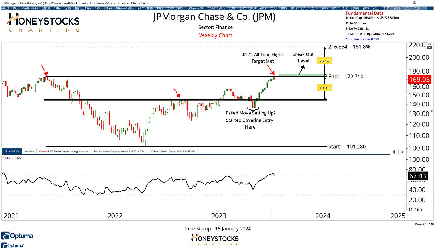
J.P Morgan (JPM)
We’ve got earnings out the way and while I’m personally not always too keen on buying all time highs, I much prefer those buy low : sell high charts, and JPM has actually just hit our upside targets (we’ve been covering the stock a while), a break out would be further bullish behaviour and it absolutely could still go on a run.
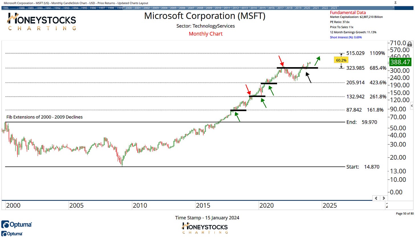
Microsoft (MSFT)
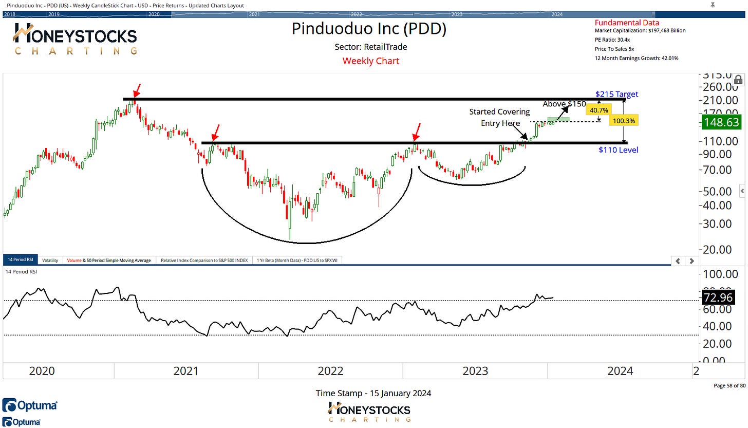
Pinduoduo (PDD)
Microsoft and Pinduoduo are 2 of the charts from our premium chart books and both are looking quite constructive from a bullish perspective.
PDD needs to break out above the $150 level, we’ve been covering this 1 of a while already but it’s worth adding that it does have that China risk attached.
MSFT for me has finally flipped AAPL as the top dog around town, and for me, the chart is a textbook Fibonacci chart.
In Conclusion
As with last week, I’m not over-thinking the index levels too much, I’m certainly aware of the implications of what failed break outs mean, but my message to our members this weekend has been to keep it simple and focus on the individual charts for the individual stocks.
We also have earnings season kicking off, so it promises to be a wild couple of weeks.
I laid a lot out this weekend in our premium work.
The charts above are just a few of the 30 charts presented over the weekend in addition to the 100’s of stocks, ETF’s and Commodities we’re covering in our chart books.
I’d recommend checking that out below.


