Before I get into this weeks letter, I’d like to start by making a few acknowledgments.
I hereby acknowledge that,
I know the yield curve is inverted
I know economic indicators point to 1929
I know earnings are upon us
I can see both the bull AND the bear case
Now that we have the awkwardness out the way for some of you economic folks who don’t like the word bullish, lets dig into some of the charts and try make sense of what I think is actually a pretty straightforward technical market at the moment.
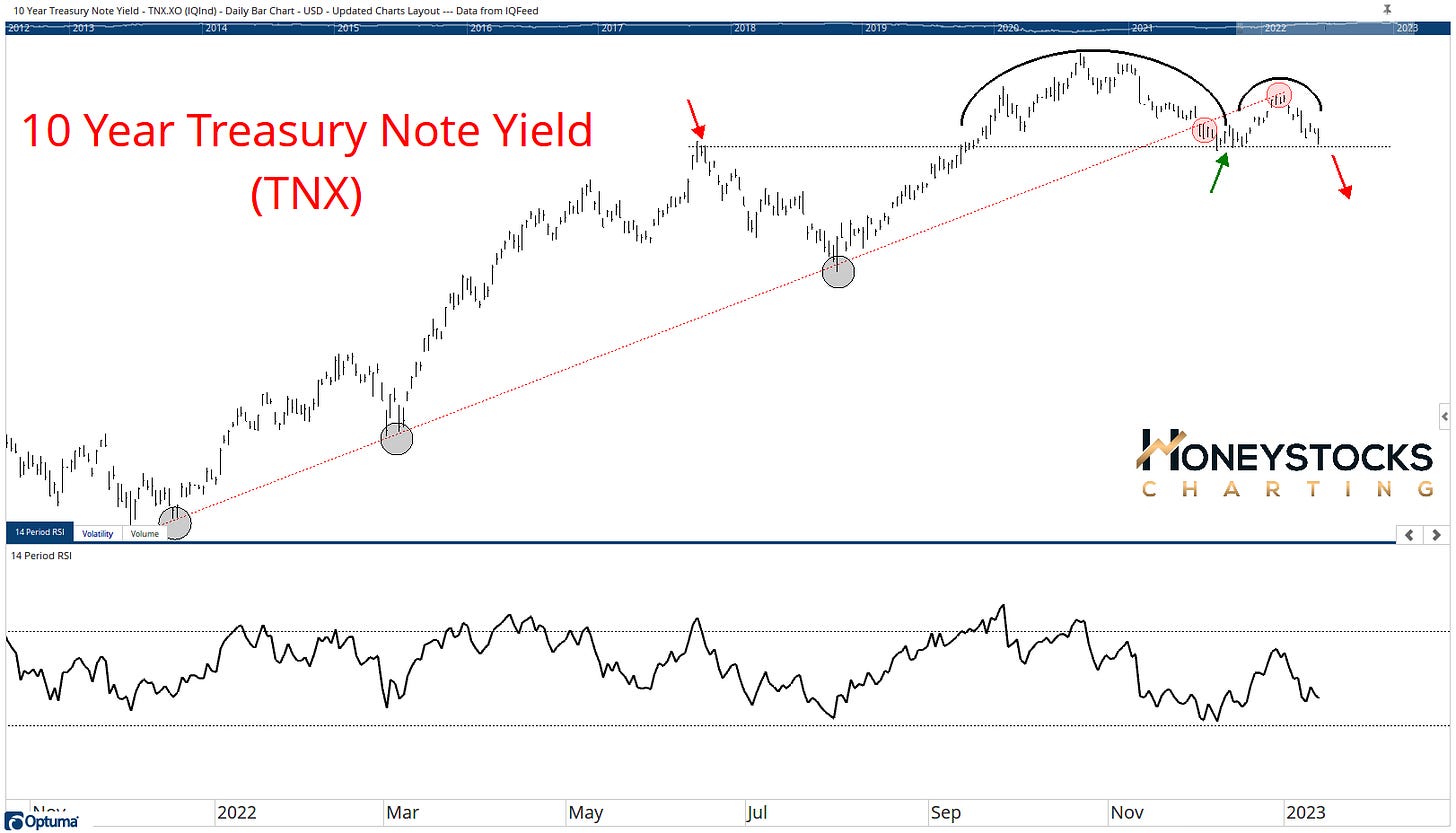
10Yr Treasury Note Yield (TNX)
The 10Yr Note has been a massive headwind for anything tech / growth over the last 12 months. Between that and the US Dollar, those 2 charts have decimated everything growth in 2022.
As you know, I’m looking forward as it’s now 2023.
The 10yr is starting to look a little “toppy” to me.
If (and it’s still an if) it breaks down, I expect a rotation (at least in the shorter term) into some growthier areas.
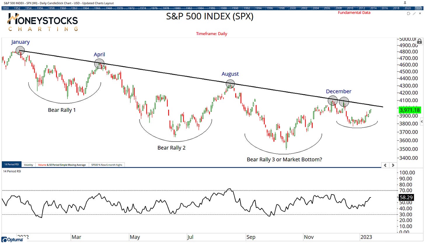
S&P500 (SPX)
We’re off to test everyone’s favourite trend line in the coming days.
I’m personally less focussed on the S&P500 as most of you will have observed over the last few weeks, I’m more focused on the NYSE Composite.
It is a problematic chart given the market has sold off on numerous occasions.
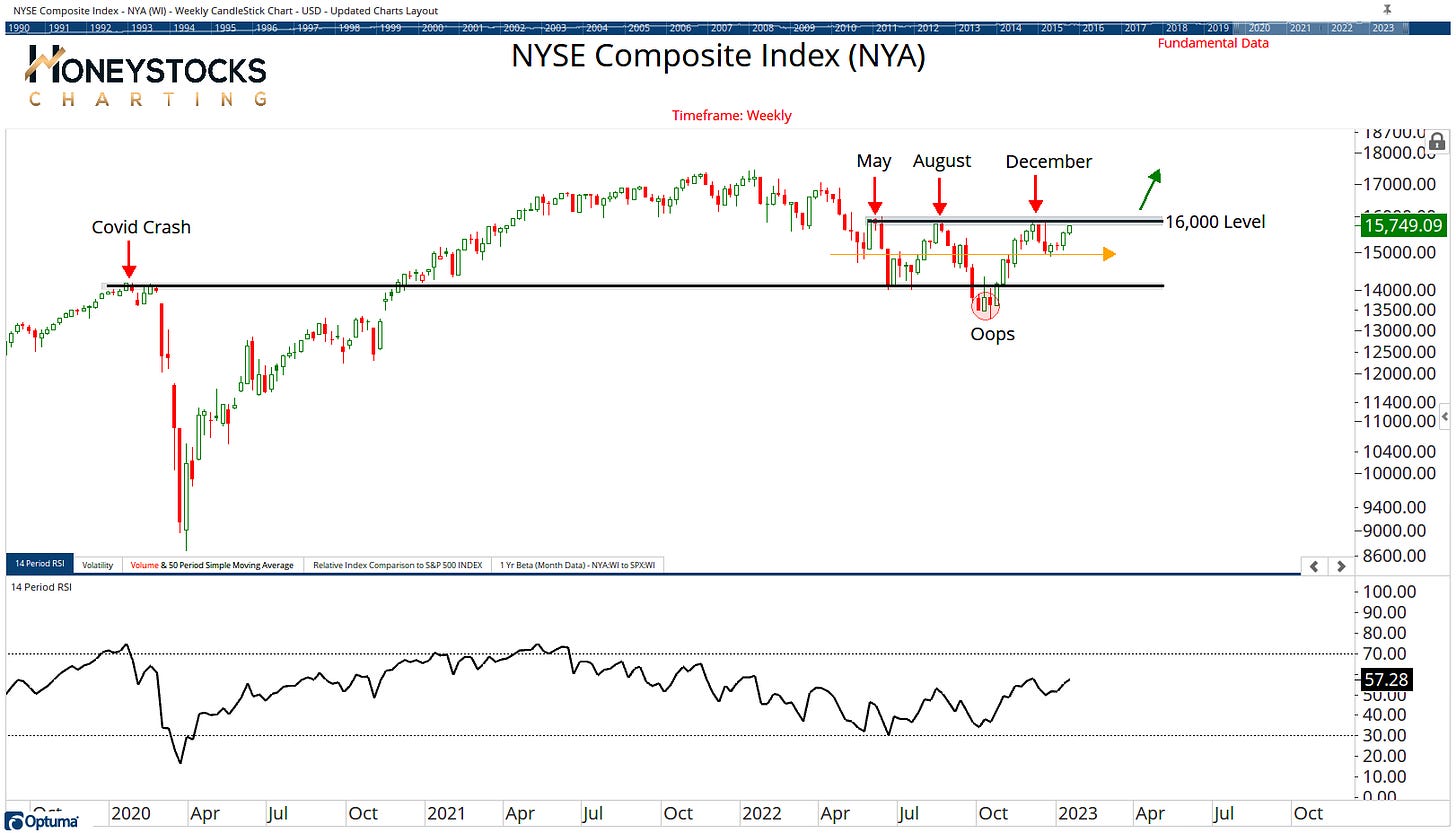
NYSE Composite (NYA)
That said, the S&P500 has too much mega cap tech and not enough Industrials / Materials etc.. which is where the massive moves have been over the last 6 months.
The NYA is much broader chart that encapsulates the total market.
Above 16,000 I think the market continues to rip.
We’ve actually been bullish plenty of tech names, mostly semiconductors so here’s a couple of our premium charts.
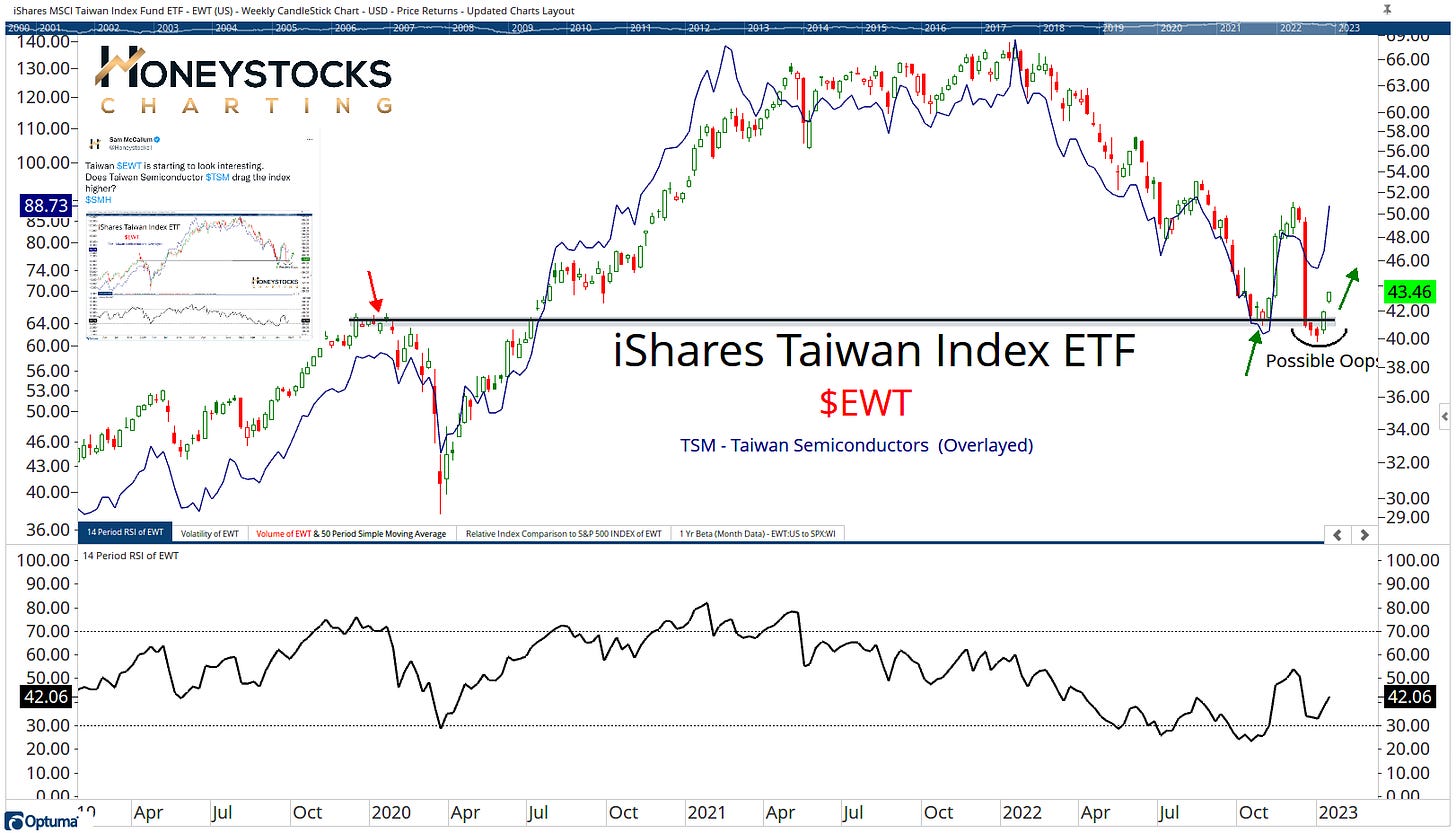
Taiwan Semiconductors and Taiwan (TSM & EWT)
3 days ago we put the above chart to our members (I also posted to Twitter - timestamp chart included above) highlighting a failed move in Taiwan when TSM was $78.07.
I think there’s a lot more runway higher, however entry is a little tricky at current levels unless you’ve already picked it up.
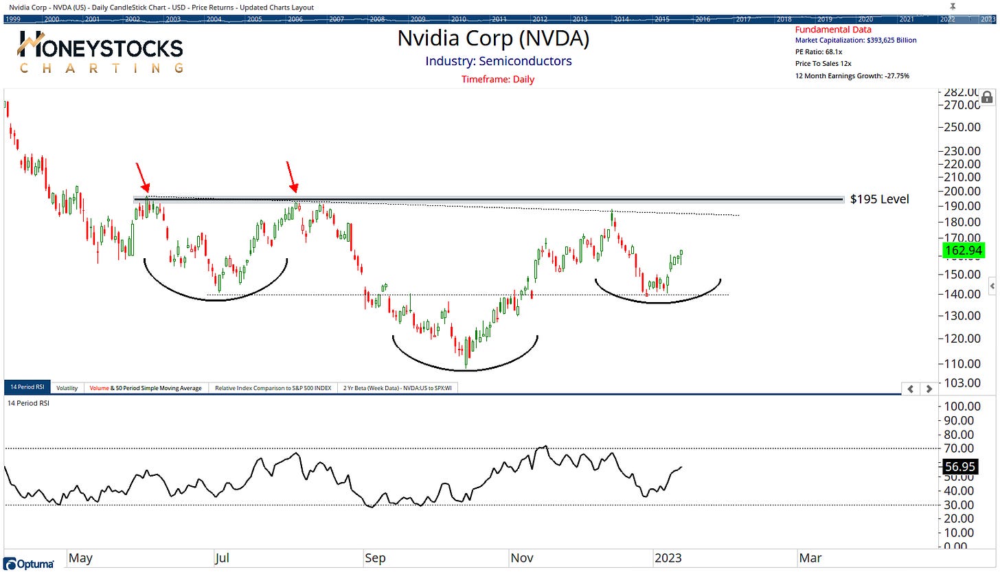
NVIDIA (NVDA)
NVDA is also a chart we’ve been working with over the last few weeks highlighting the likelihood of a chart pattern, and it does look to be heading toward the upper end of its range.
I laid out a bunch more charts at the weekend via our YouTube Channel for those who like logical charts and data.
The Technical Market Risks
Nothing is without risk. Like I’ve acknowledged above, I can also see a scenario where the S&P500 sells off with a spike in the VIX.
Until that happens though, I prefer to acknowledge the expansion in market breadth and the obvious uptrends / rebounding areas of the market.
Conclusion
If we sat and had a beer together, I’d tell you I’m leaning toward a break out in the NYSE Composite and S&P500 charts, with the US Dollar and 10Yr Note continuing to weaken but as a note of caution, a lot still has to happen for a full blown rip higher in Tech, but plenty of charts are constructive.
I think we’re edging closer to “risk on” and that’s what I’m ultimately hoping for, because uptrends are easier to navigate than downtrends and I think everyone would like a break.
I’m not managing billions of dollars so I’m ok with taking advantage of uptrends and having a systematic process that takes me out if price tells me to.
How about you?


Great writeup.
So incrementally bullish...
Personally, I think we can pivot to being more constructive once 1. a healthy amount of SPX companies have reported (not as much focused on the earnings themselves in terms of beats but the management commentary and guidance); 2. we hear the Fed's thoughts on February 1st (real guidance and not just the hawkish media tour the FOMC members love these days), and 3. SPX climbs above the 200DMA with RSI at its back.