In this weeks letter, I’ve been wrestling back and forth with what to talk about this morning.
ICYMI - I’ve already put out 2 strong letters this year.
12th Jan - The Return Of Tech - What it would take to get bullish Tech. (still in the works)
This week, the US markets are now pushing against key levels in a few major indexes, and I’m guessing the big question everyone has is something along the lines of where do we go next?
Is it blue skies ahead or do we head to the depths of Mordor?
Let’s dig into some of my charts and let’s start with everyone’s favourite trend line.
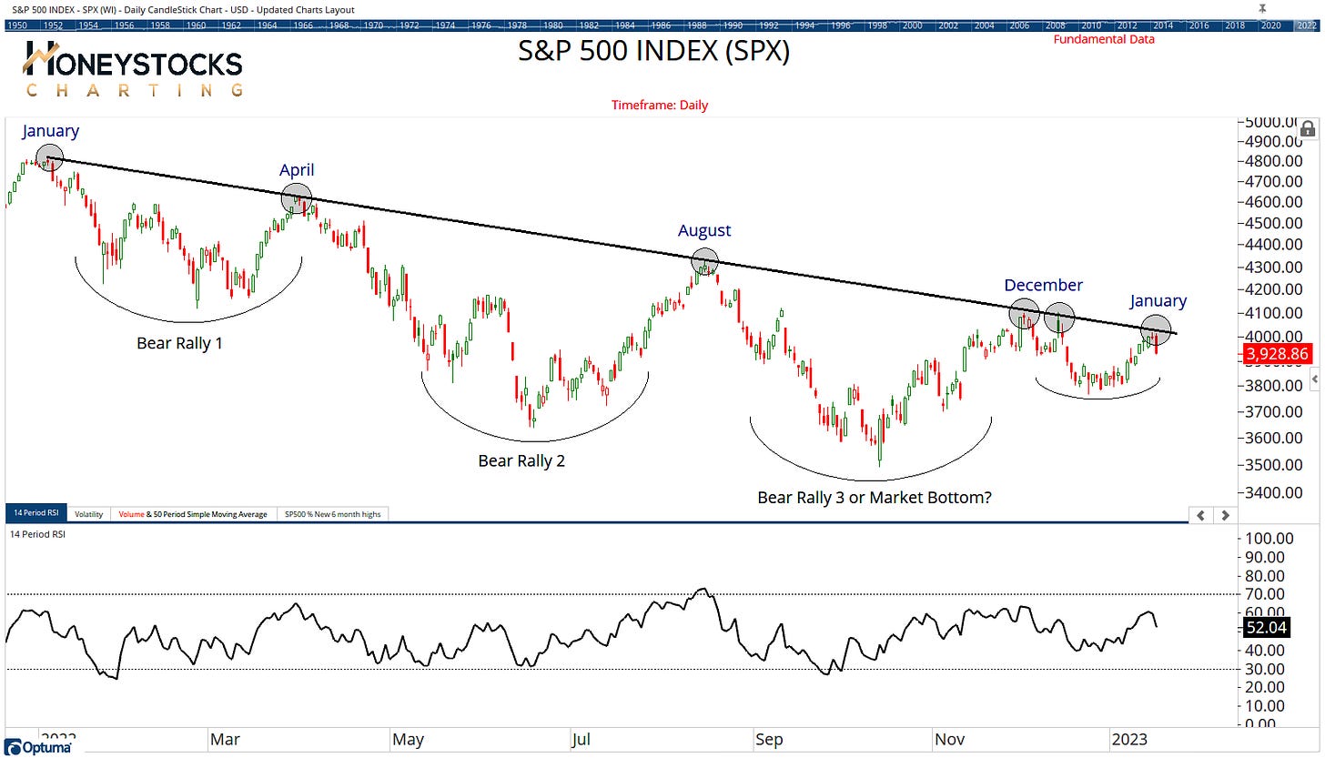
S&P500 (SPX)
Price provided some big information yesterday with the biggest 1 day market decline in a month.
For me, it’s really no surprise given the significance of the trend line, but where does the S&P500 go next?
There are some clues elsewhere.
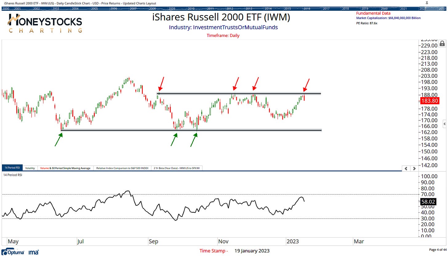
Small Caps (IWM)
Yesterday was particularly messy for many of the stocks under the $2B Market Cap, again, no real surprises.
When the major averages hit these levels, in my world, price is just telling me to manage risk a bit closer on positions that are more shorter term within my time horizon (aka profit taking or stop loss tightening).
Between the S&P500 and Small Caps, that’s 2 major averages pushing against overhead supply.
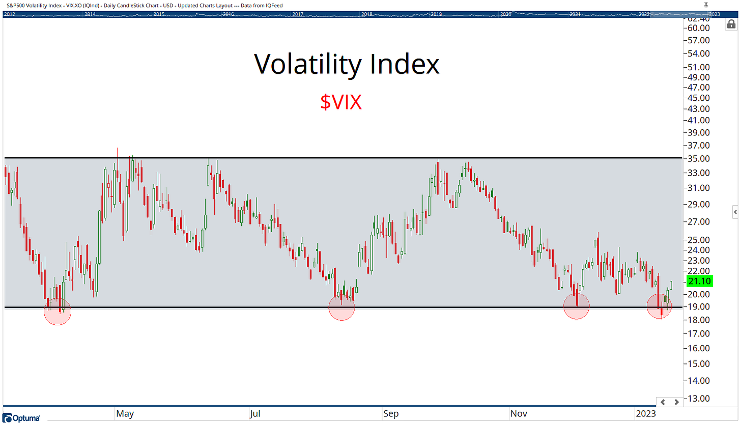
Volatility Index (VIX)
Lets add another “biggy”.
The VIX is back at the low end of its range, so again, it’s no surprise we’re seeing a spike in volatility running in tandem with those market resistance levels highlighted above.
When we put it all together, the information is very much saying “be cautious here”.
Please Note: Our memo to our clients & members within our Premium broader market analysis over the last week has been to consider booking good profits on some top performing stocks from the last few months.
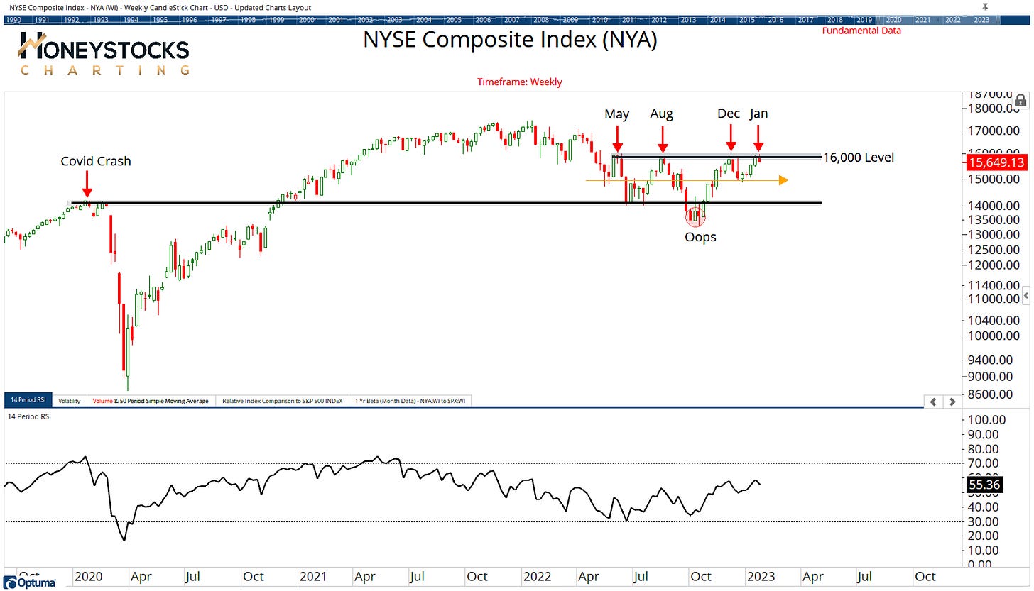
NYSE Composite (NYA)
The NYA chart for me is a much better representation of what’s actually been going on the with the market and it’s telling the same story.
Basic overhead supply = chop.
We’ve seen MASSIVE moves in many of the boring Industrials, Metals, Mining and Materials stocks over the last few months (to name just a few)… they all bottomed last year and if you’ve followed my work for more than 5mins you’ll know I’ve been well on top of that.
They can continue to move higher, but it’s going to be messy until we get a resolution in the charts highlighted above.
But It’s Such A Tough Market?
I get lots of questions & comments along the lines of, but Sam, it’s such a tough market to read.
My response couldn’t be more opposite because I’ve just highlighted 4 charts that will serve you much better than assessing job loss data. True story.
I think it’s actually pretty straight-forward from a Technical standpoint. (I stick to my lane and what I’m good at and like to stay well away from economics / macro).
If you’re in the camp trying to figure out if price WILL break out or if it will DECLINE from current levels, here’s something to consider.
Don’t guess, and don’t try to figure it out… just identify the levels, and manage risk at the levels highlighted, because that’s truly all you can do. I learned that a while ago.
Conclusion
We can all have our opinions based on never ending data sets I’m sure, but I personally like to keep in mind that the ONLY thing that matters is price.
I’m still providing bullish charts to our clients / members and identifying optimal buy points for stocks, but of course, being VERY selective.
At these levels, I’m open minded to all outcomes and you should be too.
There are some clues I’m watching closely but the US Dollar for me is still going to be the key to it all.
What do you think matters most?


